Hi, y'all,
many decades ago (when dinosaurs roamed the earth and I went to school) we learned proper handwriting, and I practiced my first bows and hooks on a slate (made from plastic, I guess). And our teacher then judged our writing whether it was really pretty, looked like a chicken crossed the street or whether a GP wrote a prescription only the MTA can decipher.
During the course of time I developed a more or less nice looking, more or less legible handwriting, and until my high school graduation I wrote all homeworks, notes and exams by hand. For my 18th birthday I got an electronic typewriter and learned to type with all ten fingers, which was an awesome development considering my single-finger Muhammad Ali technique: float like a butterfly, sting like a bee! After 30 years of working as an EA, I now seldom write by hand (only notes on the phone and my groceries list) because it is much faster with a computer and less tiring for my hands.
But I always liked calligraphy - and I even remember taking part in a calligraphy weekend workshop once. Nowadays there is a new trend with a nice new name - calligraphy is now called handlettering, although it is pretty much the same. Except that you now can combine different techniques and different fonts and add some design to it. A subspecies is called fauxligraphy and you guys with an affinity for language might guess where that comes from. In calligraphy you usually write with a quill and whether you draw up or down, the stroke gets thinner or wider. If you use a modern pen with a fine tip you don't have that effect but you can fake it by reinforcing every downstroke. In that way your pen acts as a fake (or faux) quill and that is the reason for the term fauxligraphy.
Before you fall asleep by my lectures, I will show you my beginner's attempts on handlettering. At first I created backgrounds by adding watercolors onto a wet acrylic plate (you could use anything which doesn't soak water, like a plastic bag for instance) and then pressing my paper onto that plate and lifting it up again, like a reversed stamp method. After drying, I started with single words and funny slogans. Admittedly, I began by copying existing designs, and the development of my personal style might take some time. So far, I didn't produce epic fails, but I can say that I like the newest projects more than the first.
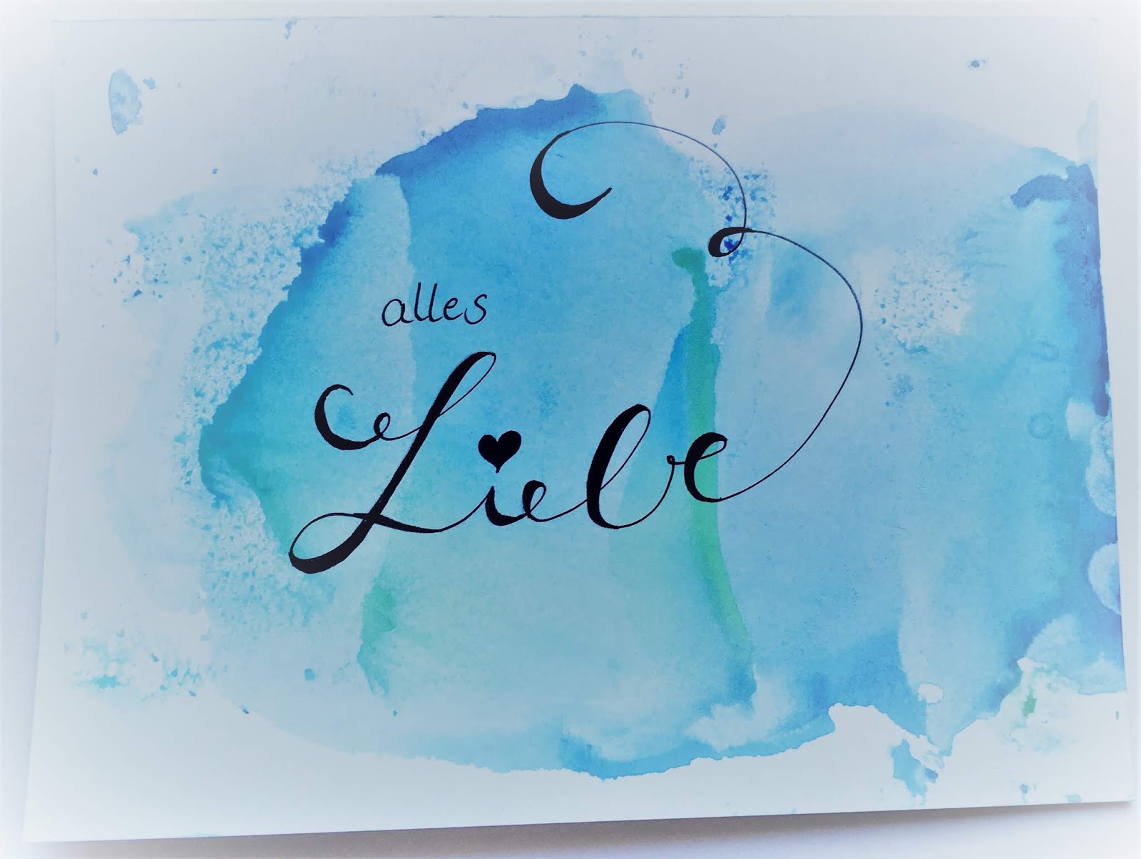
Here we go, little doodles to warm-up - as you can easily see, I used them as greeting cards for mother's day:


Little baby steps:

Surrounded by some more doodles:

(Translation nearly impossible... There is always room for sea/There is always room for more (In German more = mehr and sea = Meer) :-(
Slowly adding more text...

(Dance about it (instead of think about it)
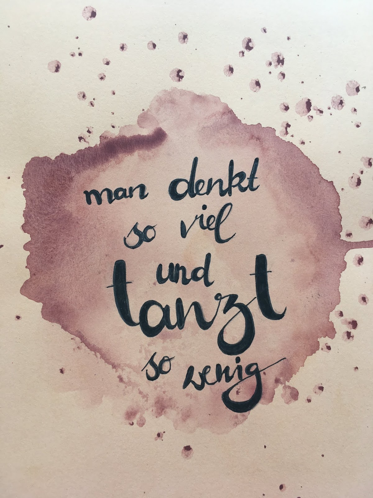
(You think so much and dance so little)
The top one looks like I was trying hard,
but the bottom one bears a certain lightness, I think...
Sometimes a funny text distracts from stilistic weaknesses :-)

(Could tomorrow be Sunday again, please?)

(You have to be careful with sugar, it's clever/refined)
(In Germany refined and clever is both raffiniert))

(A party without cake is only a meeting)
And now my favorites - some simple but witty, some squiggly and some a combination of various fonts and shapes:

No translation necessary :-)

I cooked - on the menu: coffee
(in German you cook coffee, therefore it's kind of funny)

(Empty wine glasses are full of stories/memories)

(My thoughts are at the sea - barefooted)
Think of having them in a matching frame - could be soooo pretty.
With this in mind - stay safe and creative!
No comments:
Post a Comment